Joined as employee #11. The Transporter App MVP shipped in 3 months, built by an external studio on my flows and usability tests. The service journey I designed supported the seed round, closed in under 12 months. Within 18 months, the operation reached 400+ clients, 3,000+ tons of waste collected and reused, 5+ transporter partners and 20+ drivers.
3 months
to ship the MVP
<12 months
to the seed round
400+
clients in 18 months
3,000+ tons
of waste collected and reused
Context
Everything was still TBD
Musa wanted a world without waste, where materials are recovered and reused instead of sent to landfill. When I joined, there was a mission and no product scope. Three actors had to work as one system:
Generators: businesses producing waste
Transporters: drivers and fleet partners collecting it
Recyclers: facilities processing and reusing materials
My role covered UX and service design, visual design, and product coordination between an external brand agency and a development studio.
The Problem
Three problems
1No shared mental model.
Everyone had a different answer to "how does it work?" That made it hard to pitch partners, sell to clients or prioritize anything.
2The transporter side was fragile.
Drivers work under time, routes, paperwork, connectivity and safety constraints. Collection is where digital meets physical. If it failed, the whole service failed.
3Urgency to prove traction.
We had to go from discovery to something shippable fast enough to unlock investment.
Act 1
The journey
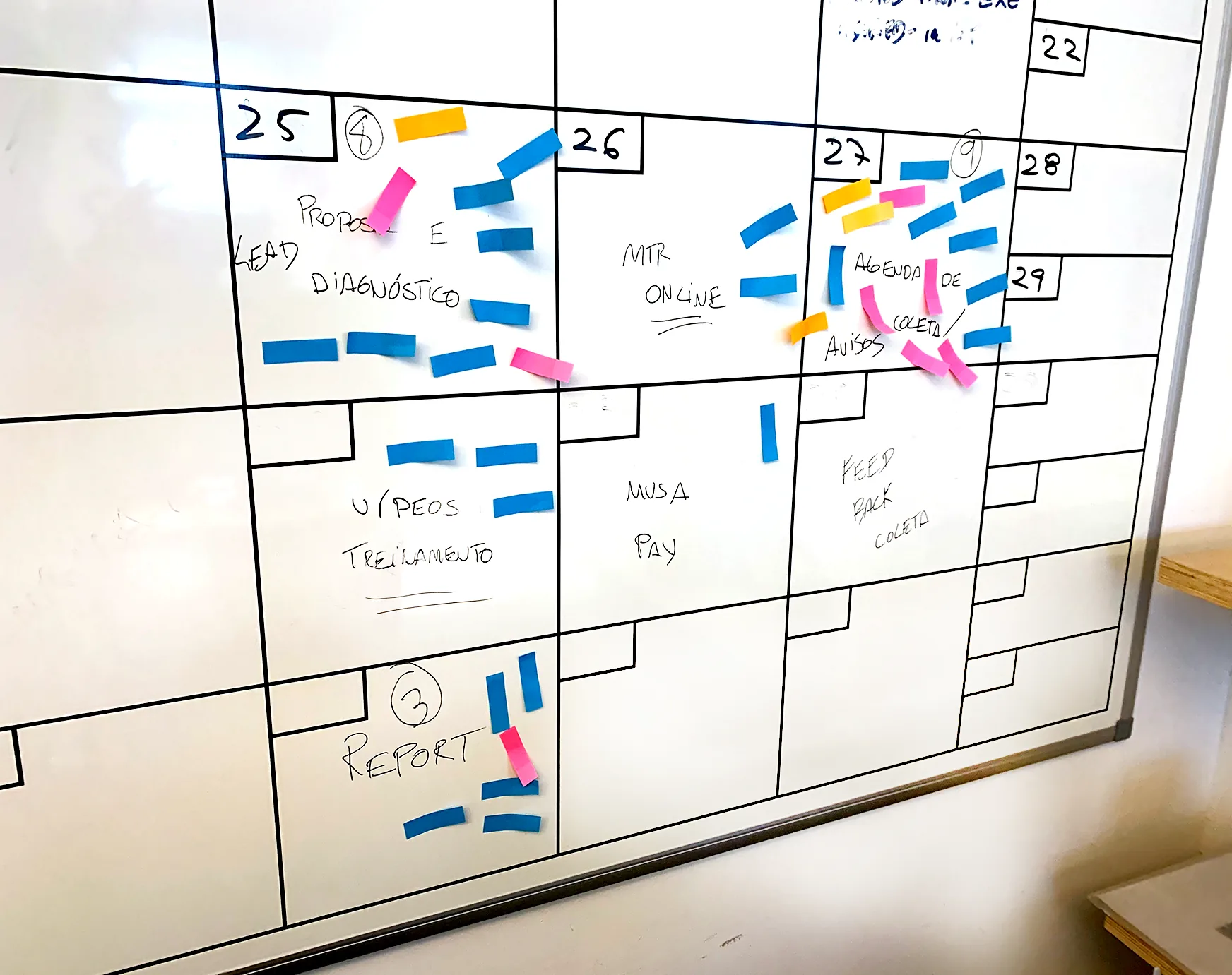
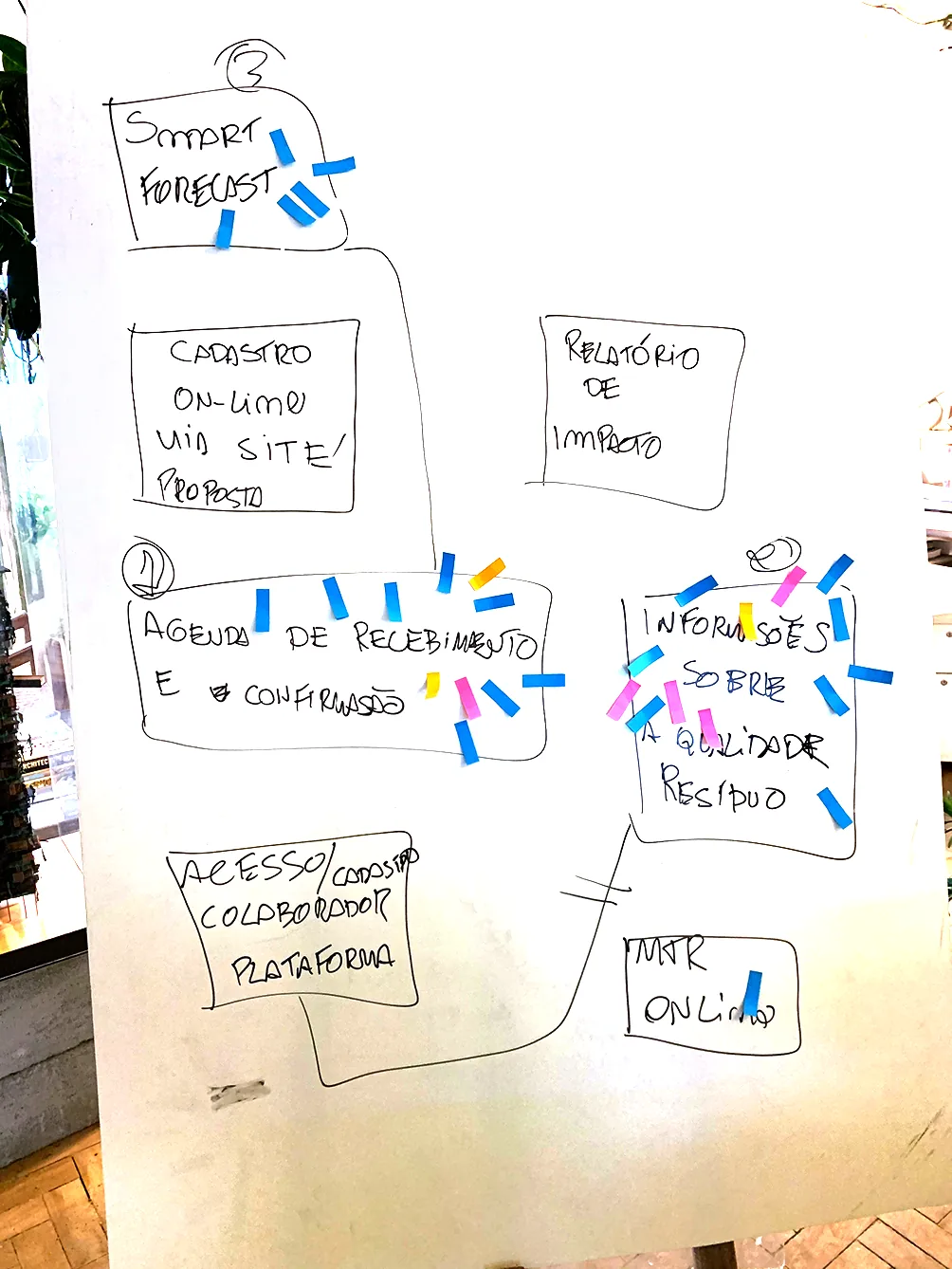
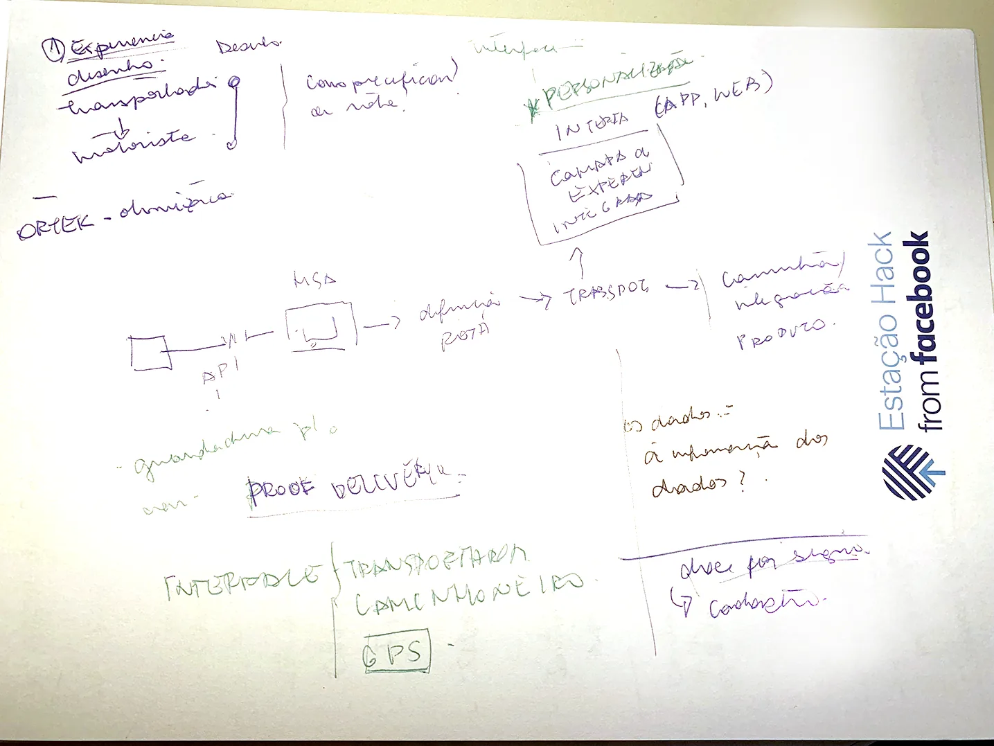
Discovery started on whiteboards: team workshops, actor and value mapping, and interviews with drivers, generators and recyclers.
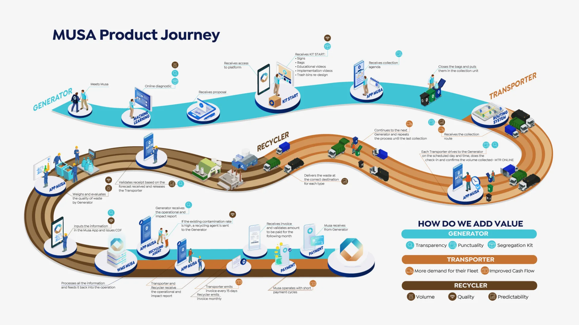
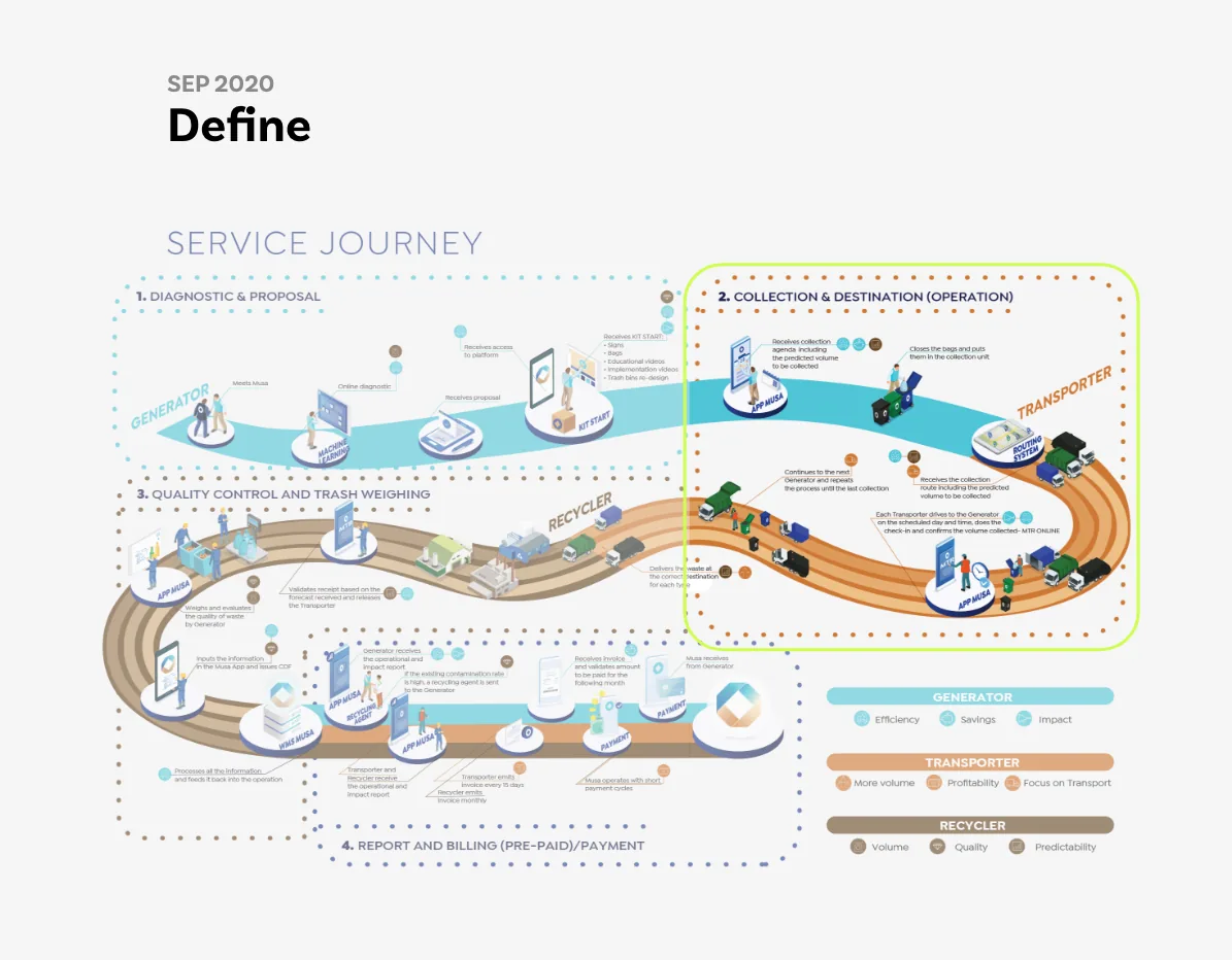
From that, I designed the service journey: how technology connects Generator → Transporter → Recycler, stage by stage. It became the shared language of the company. We used it to align the team, to explain the service to partners and clients, and in conversations with investors.
Act 1 · Build
Building for the field
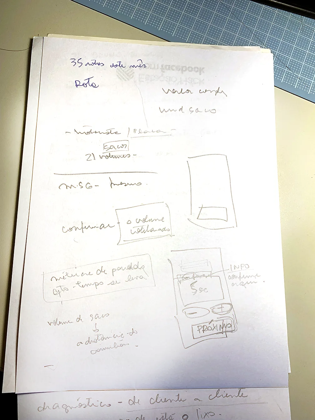
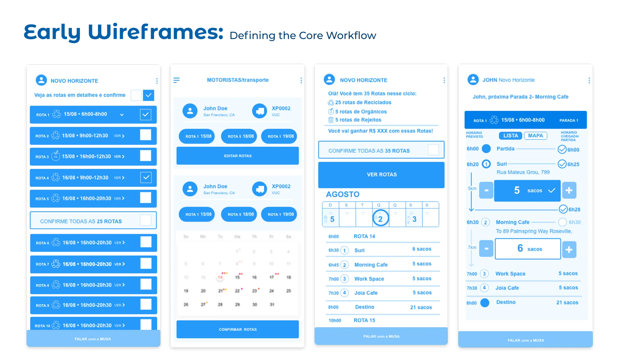
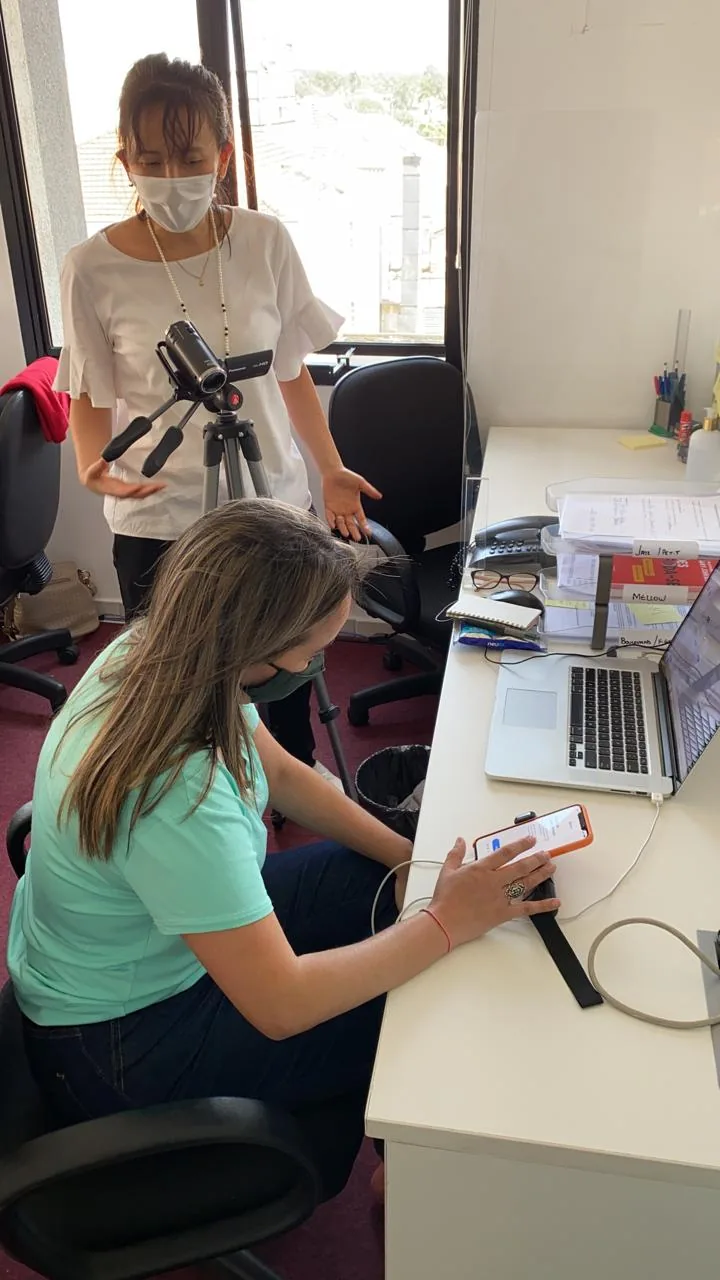
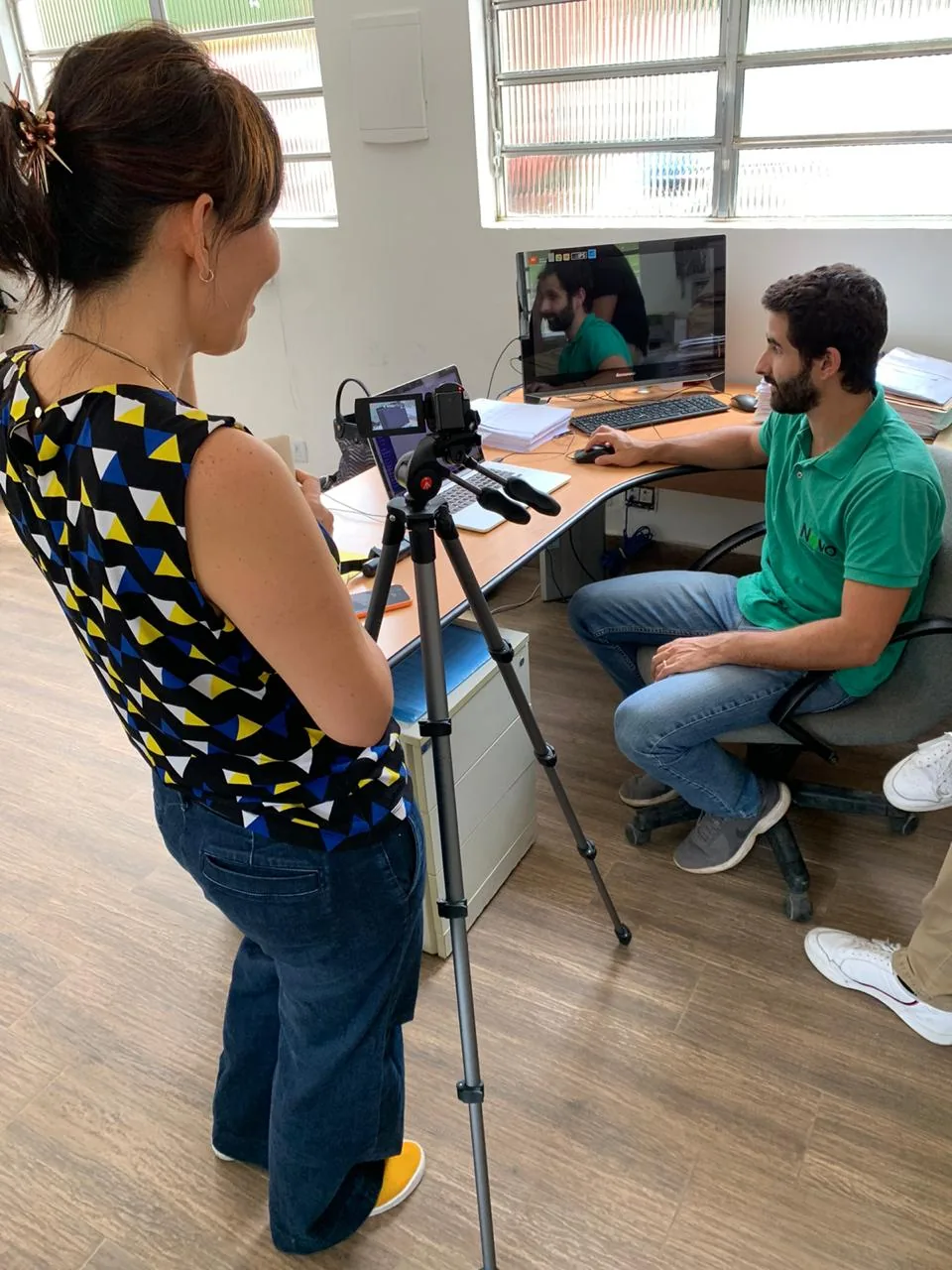
With the journey defined, I designed the core flows for the Transporter App and tested them with drivers before development.
The prototypes were brand-neutral on purpose. The rebrand was underway, and the test was about the flow, not the look.
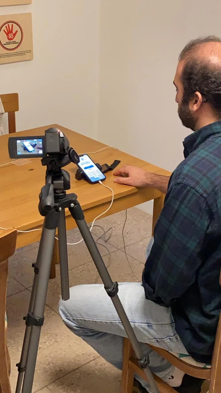
Usability tests with the prototype, before development. Every session recorded.
Prototype v1
One bag count per stop, turn-by-turn directions.
After the field test
A counter per waste type, a photo of the pickup spot, weight at the destination, and a direct chat with the route team.
What I designed for:
Linear, step-by-step collection. One stop, one task, under time pressure.
Minimal typing. Pre-filled data, photos instead of text, and a direct channel to the route team for edge cases.
The final UI was built by an external studio on top of these flows.
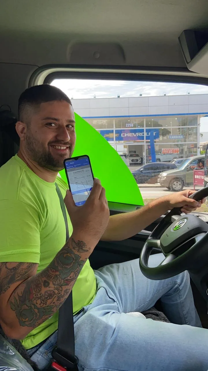
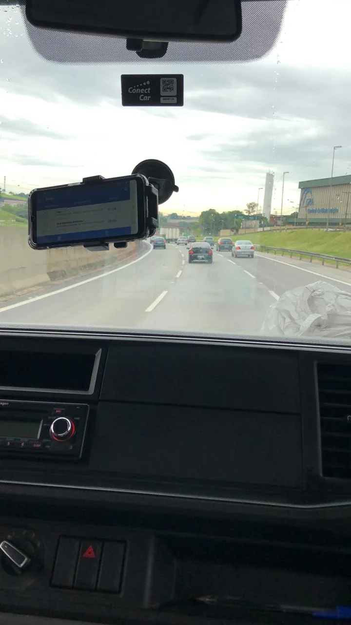
What the field taught us after launch. With the app live, we saw that many drivers' phones couldn't run it reliably. The company moved to company-provided tablets. It wasn't my call, but the reasons were UX ones: reliable hardware, and a bigger screen for waste categorization and route viewing.
Then a tablet was stolen. Hardware decisions are UX decisions in field operations.
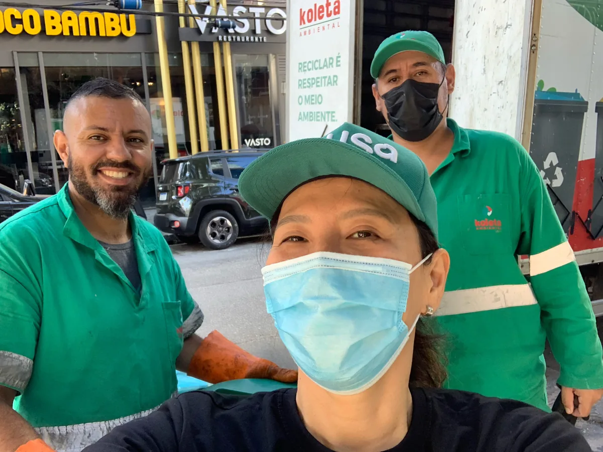
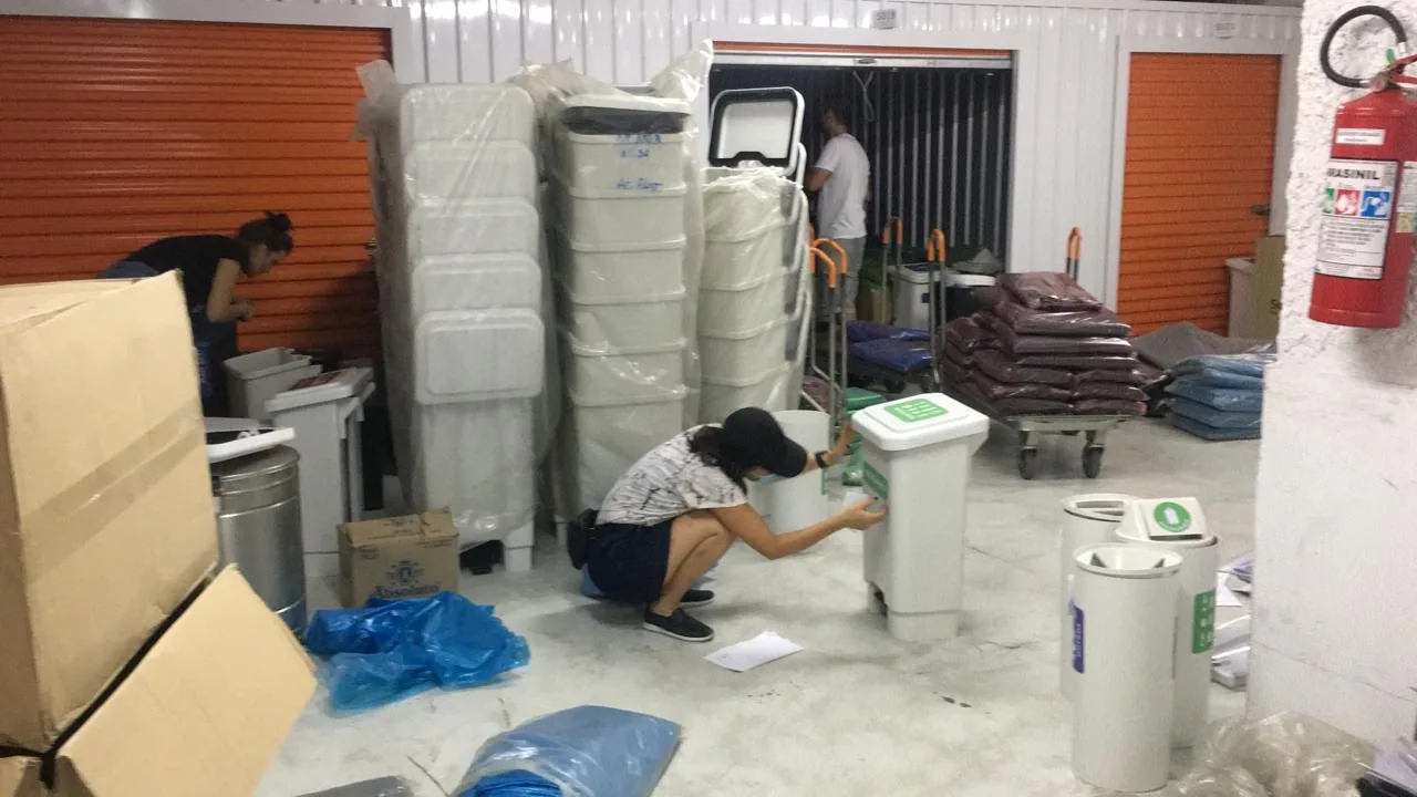
The app on the road, still on drivers' own phones. Me in the field with the collection team, and applying bin labels at the warehouse.
Act 2
From pitch to operating map
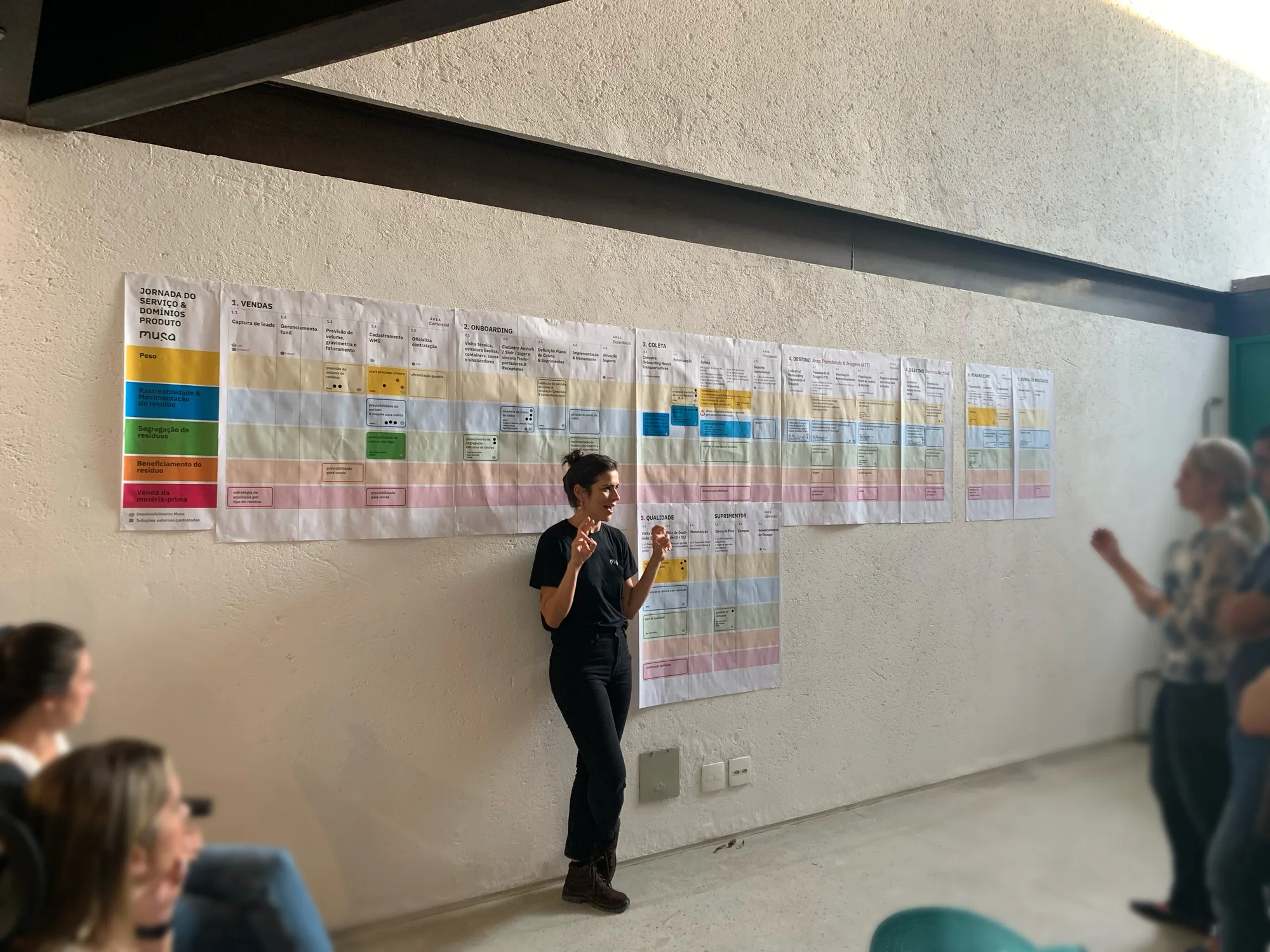
A year later, with a team of 20+, I evolved the journey into a service blueprint crossing every stage of the service with our product domains: weight, traceability, segregation, processing and sale of raw material. We presented it at our internal Demo Day to decide, together, where to focus the product effort next.
Click to open full size.Swipe to explore. Tap to open full size.
Demo Day: our PM walking the team through the blueprint I designed.
Beyond
Beyond the driver app
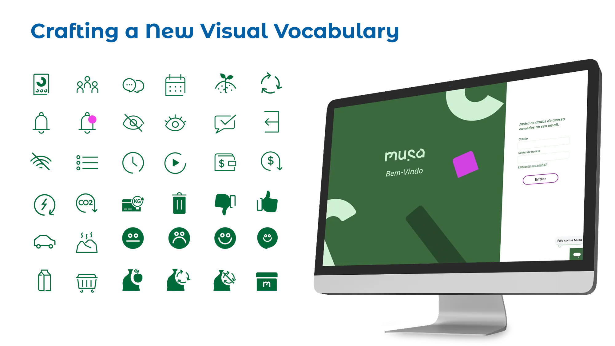
Operational icon set for waste categories and field actions.
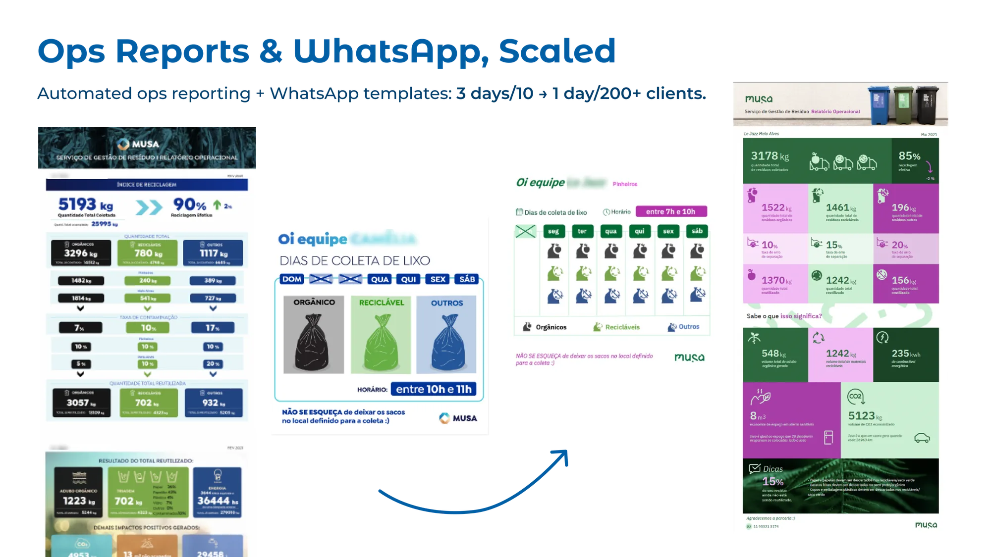
Ops reports and WhatsApp templates, automated to scale with the client base.
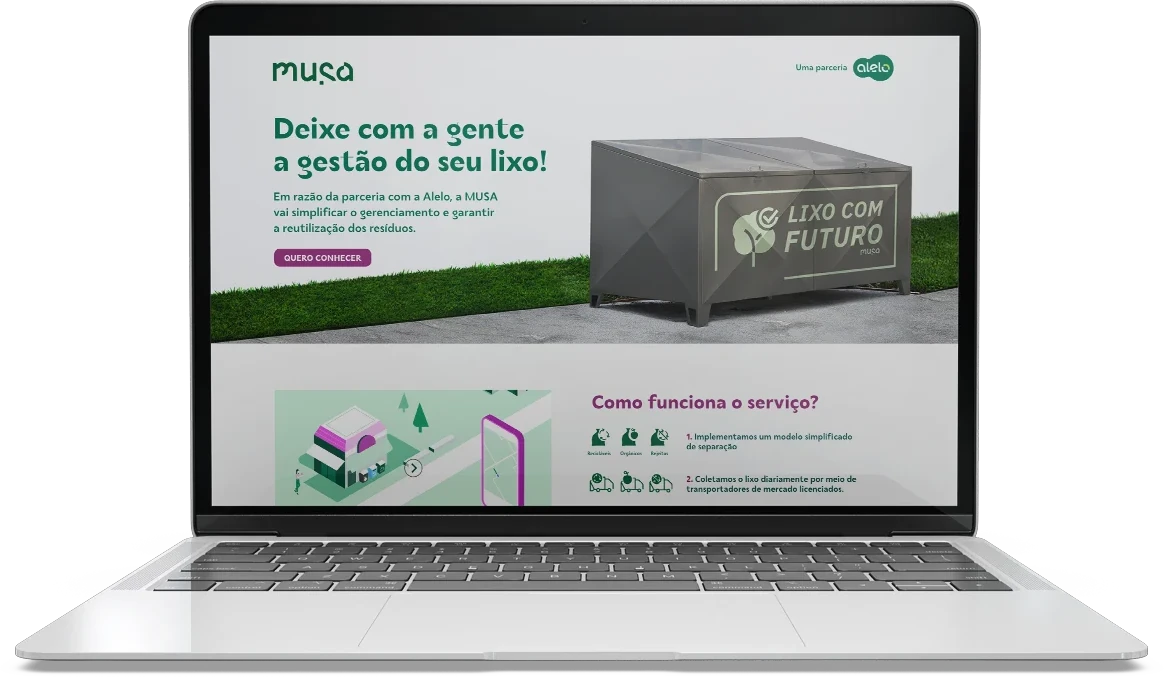
Partnership landing page for Alelo. It later became their reference for other partnerships.
Key Learnings
What I learned
Design beyond the screen. The hardest problems weren't interface problems. The device, the route and how waste got separated mattered as much as the app.
Usable is the bar. Drivers adopted the app because it removed paperwork, not because they loved it. In operational tools, that's enough.
Service clarity unlocks everything. The app was rough. The map is what got us partners, investment and, a year later, a whole team pointing at the same wall.