Women@ Leadership Day Latam
Facebook supplied the theme, logo and brandbook. I turned them into a two-day event, and ran it with the client through five months of approvals.
Stage
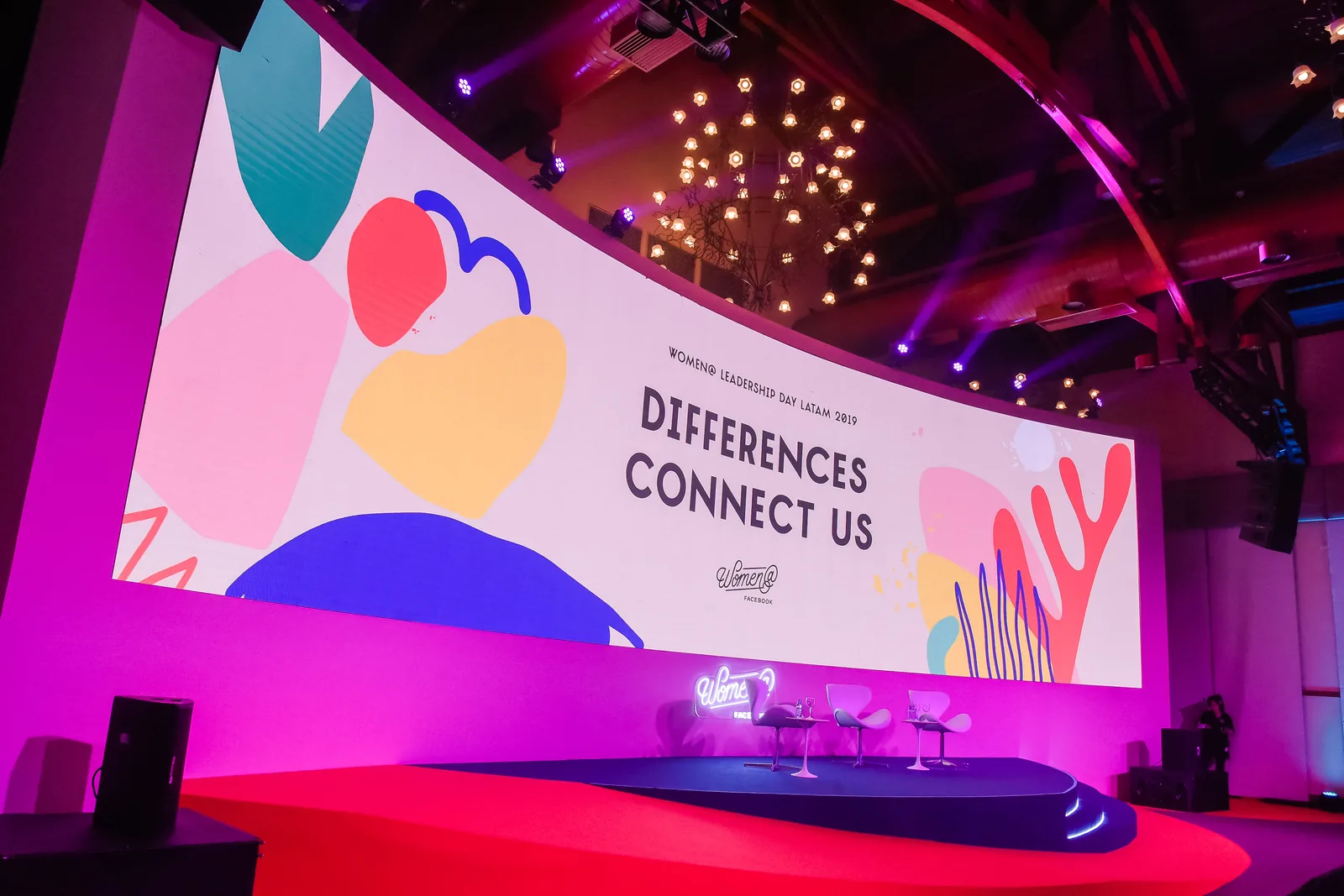
The curve wraps the key visual around the room, so the shapes read as architecture, not a projected slide.
Key visual
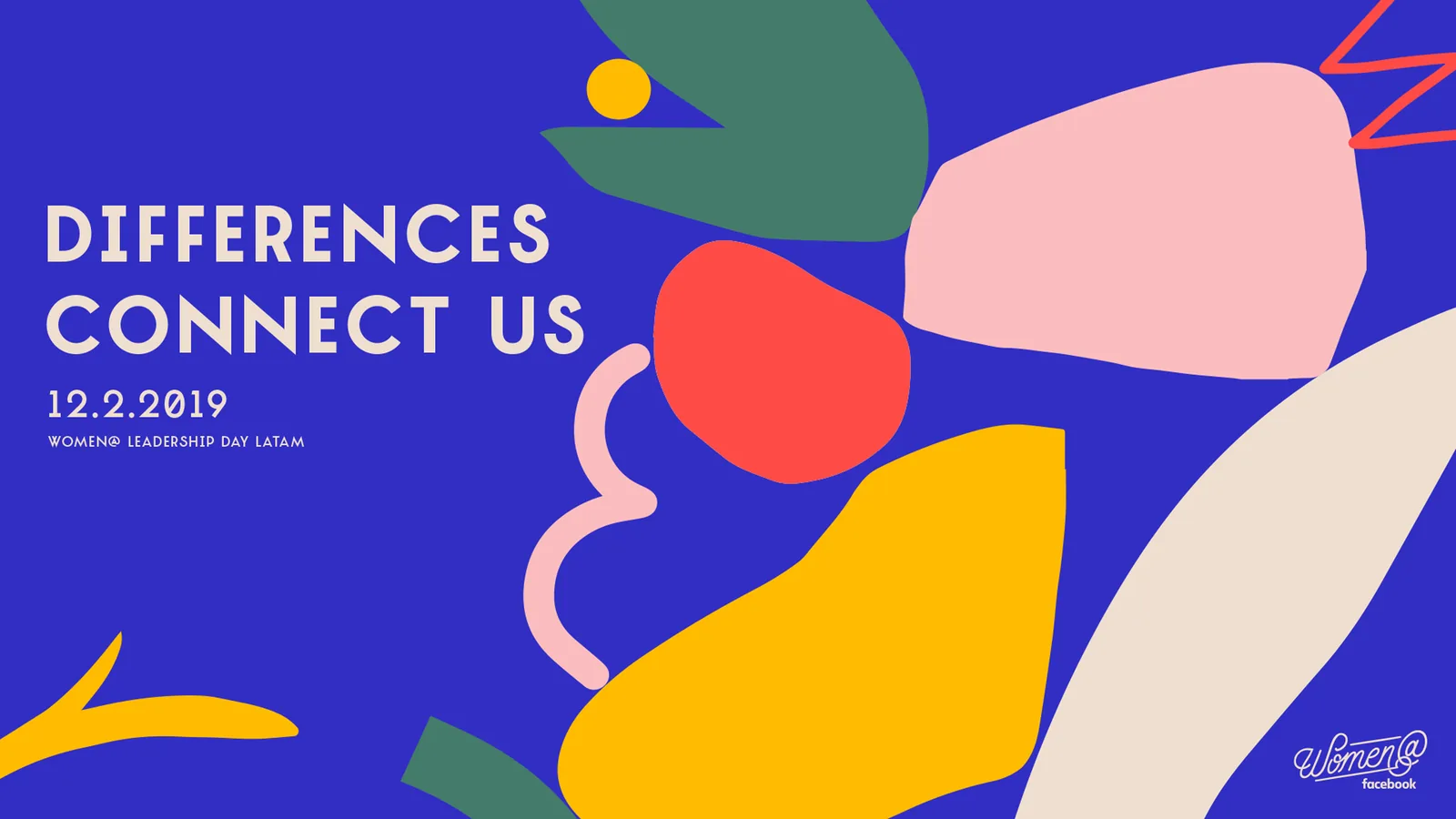
Facebook supplied the elements. I composed the key visual: shapes clustered right and bleeding off the frame, the left third left quiet for type. Every piece that follows adapts this base.
Accreditation
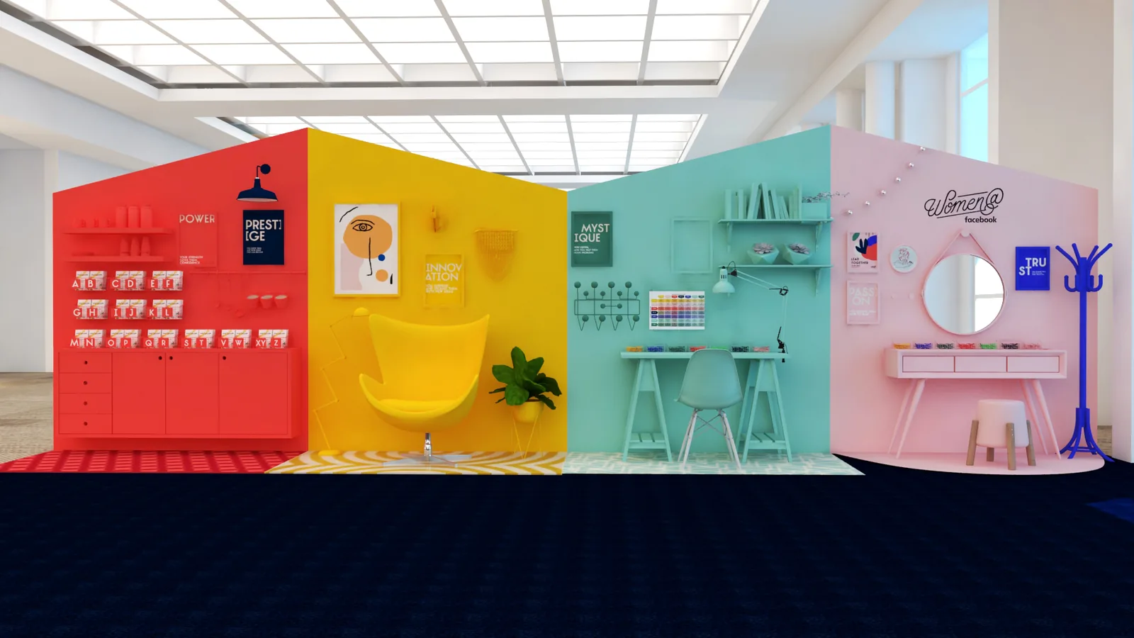
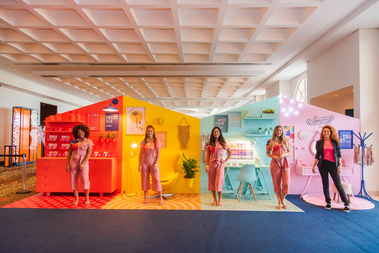
I proposed the How to Fascinate personality test as the structure of the day. Its seven archetypes became the colors of everything that followed, starting with four flat-color modules where credentials were picked up.
Uniform
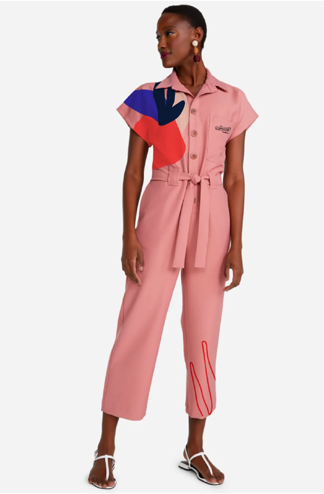
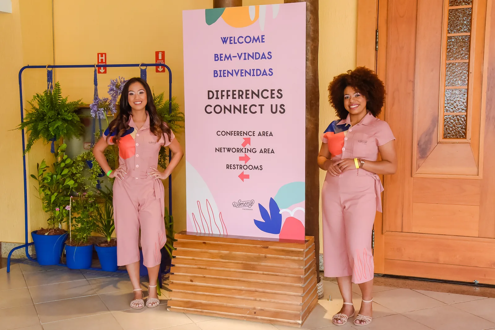
I designed the uniform: one muted pink jumpsuit, a key visual shape on the shoulder, a line drawing at the hem. Against four saturated walls, the single soft tone keeps the team readable as a group and leaves the color to the scenography.
Pins and credential
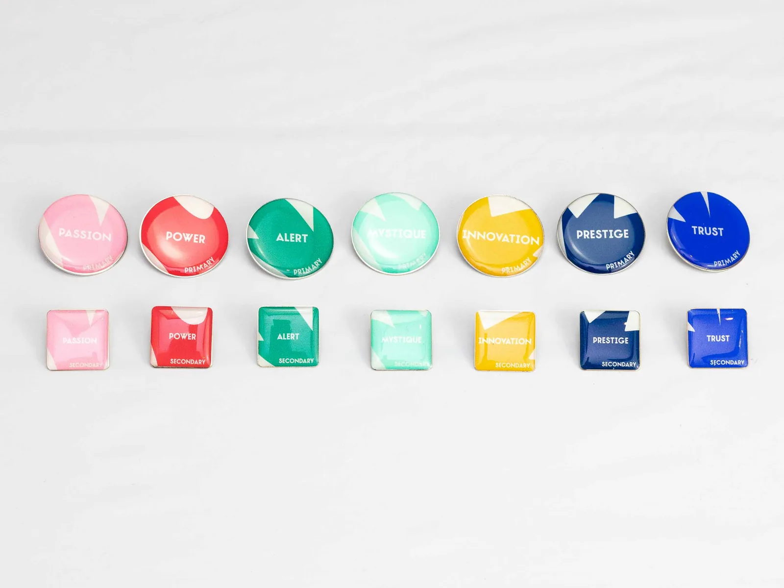
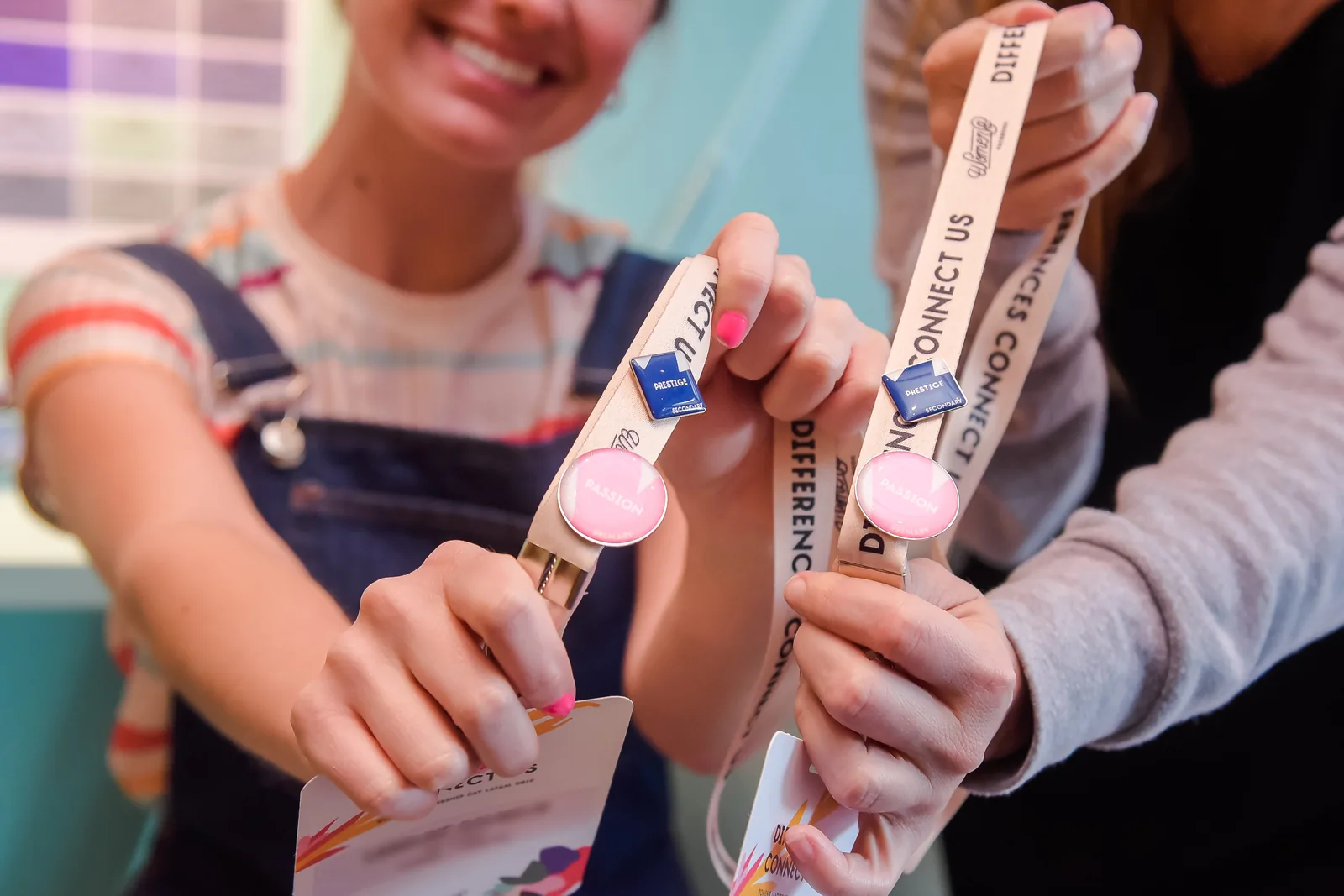
Shape carries the hierarchy, color carries the archetype: round primary, square secondary, same seven colors. On the lanyard, the pair reads at a glance. 675 + 675 pins, 330 credentials.
Archetype table
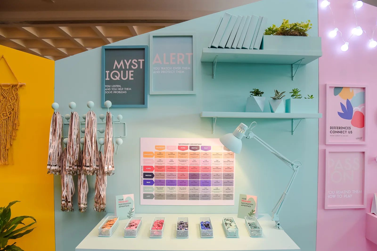
Primary and secondary archetypes crossed on one grid, in the pin colors, so any pin pair maps straight to one cell.
Graffiti wall
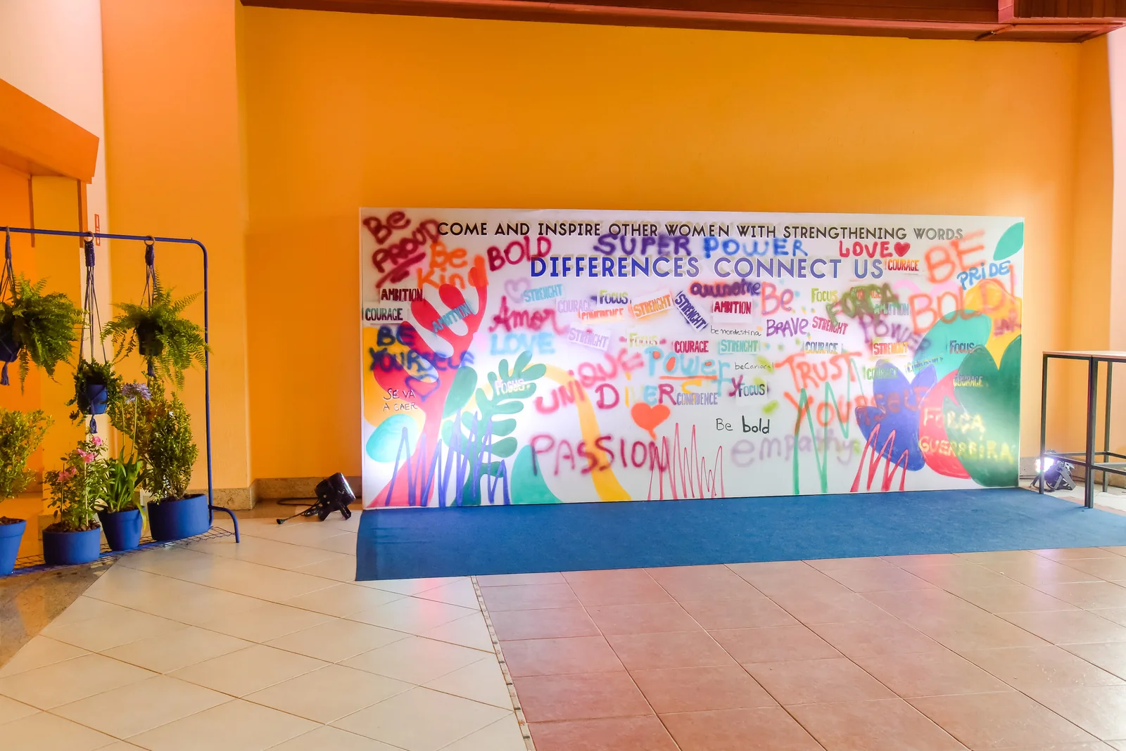
My idea. I hired Projeto Quixote, which teaches graffiti to vulnerable children and teenagers. Attendees wrote over the shapes.
Closing gift
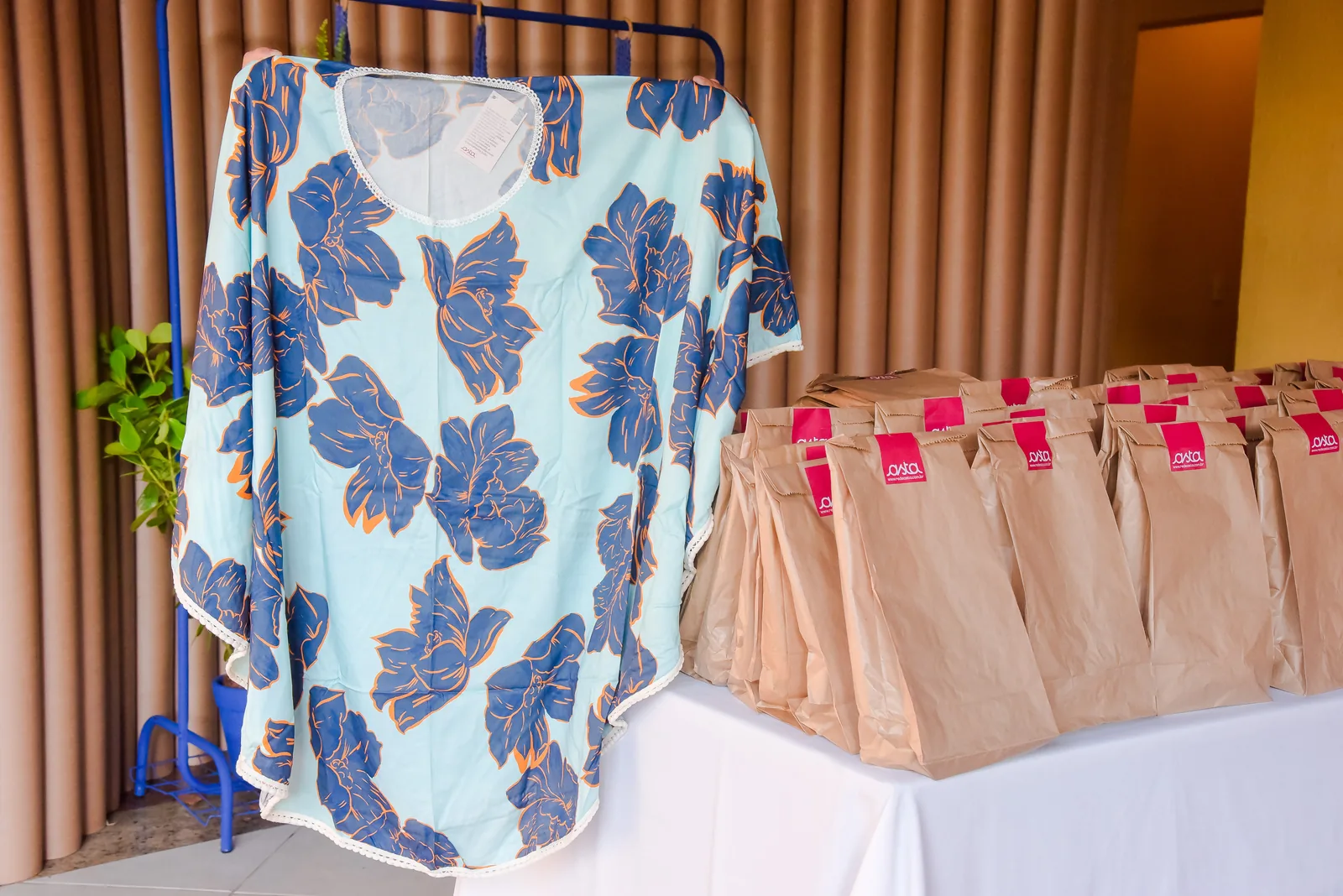
Kaftans by Rede Asta, made from fabric donated by large brands. Like the wall, the gift came from the third sector. Both were my idea, and I hired both.
Art direction: Yuki Nakamura · Scenography: with Everson Cabideli (architecture) · 3D renders: Adriano Saul · Shown with the approval of Agência People.